8 min read
8 min read
No-Code Tools I Use to Build Stunning Websites
Learn how visual hierarchy helps users understand content faster and navigate interfaces with ease.
No-Code Tools I Use to Build Stunning Websites
Learn how visual hierarchy helps users understand content faster and navigate interfaces with ease.
What Is Visual Hierarchy?
Visual hierarchy is the arrangement of design elements in a way that signals their level of importance. It uses visual cues to tell users what to focus on first, second, and last.This structure helps reduce cognitive load, making it easier for users to scan pages, understand information quickly, and complete tasks without frustration.

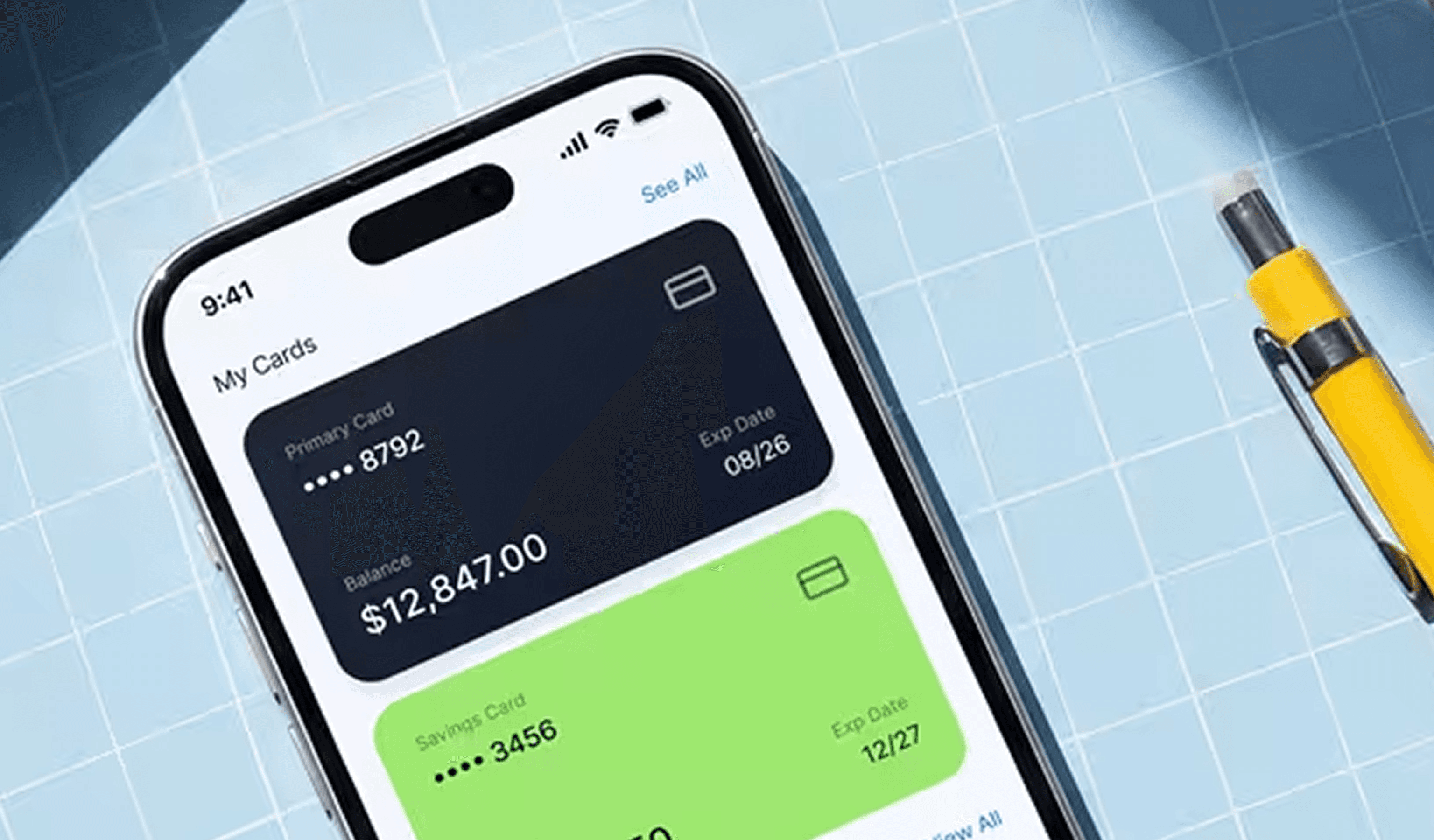
Size and Scale
One of the simplest ways to create hierarchy is through size. Larger elements naturally draw more attention than smaller ones. Headlines are bigger than body text, and primary buttons are often larger than secondary actions.Using consistent size differences helps users instantly understand what matters most on a page.
Color and Contrast
Color plays a powerful role in guiding attention. Bright or bold colors can highlight key actions like call-to-action buttons, while muted tones keep secondary content in the background.Contrast also improves readability and accessibility. Strong contrast between text and background ensures information is easy to read for all users.

Typography Hierarchy
Typography is a key tool for structuring content. Different font sizes, weights, and styles help distinguish headings, subheadings, and body text.Clear typographic hierarchy makes long content easier to read and allows users to quickly find the information they’re looking for.
Typography Hierarchy
Typography is a key tool for structuring content. Different font sizes, weights, and styles help distinguish headings, subheadings, and body text.Clear typographic hierarchy makes long content easier to read and allows users to quickly find the information they’re looking for.

Daniel Harper
UX Design Consultant
Daniel Harper
UX Design Consultant
Alignment and Positioning
Where elements are placed on a page also affects hierarchy. Items positioned at the top or center often get noticed first. Consistent alignment creates order and predictability, which improves usability.A well-structured layout ensures that the user’s eye flows naturally from one section to the next.
Visual Cues and Emphasis
Icons, arrows, lines, and subtle animations can act as visual cues that guide attention. These elements help indicate actions, highlight important information, or show relationships between content blocks.Used carefully, these cues improve navigation without overwhelming the design.

Explore More Blog & Recourse
Have a Project

in Mind?

— Let’s Talk
Have a Project
in Mind?
— Let’s Talk
Have a Project
in Mind?